Shared Space Publication
For my DES357: Integrative Design III class, our first project was to create a printed publication describing a shared space that has been a huge influence to our design practice. A shared space is any space where several people are all together, interacting with each other and/or the space they are in, and it could either physical or digital.
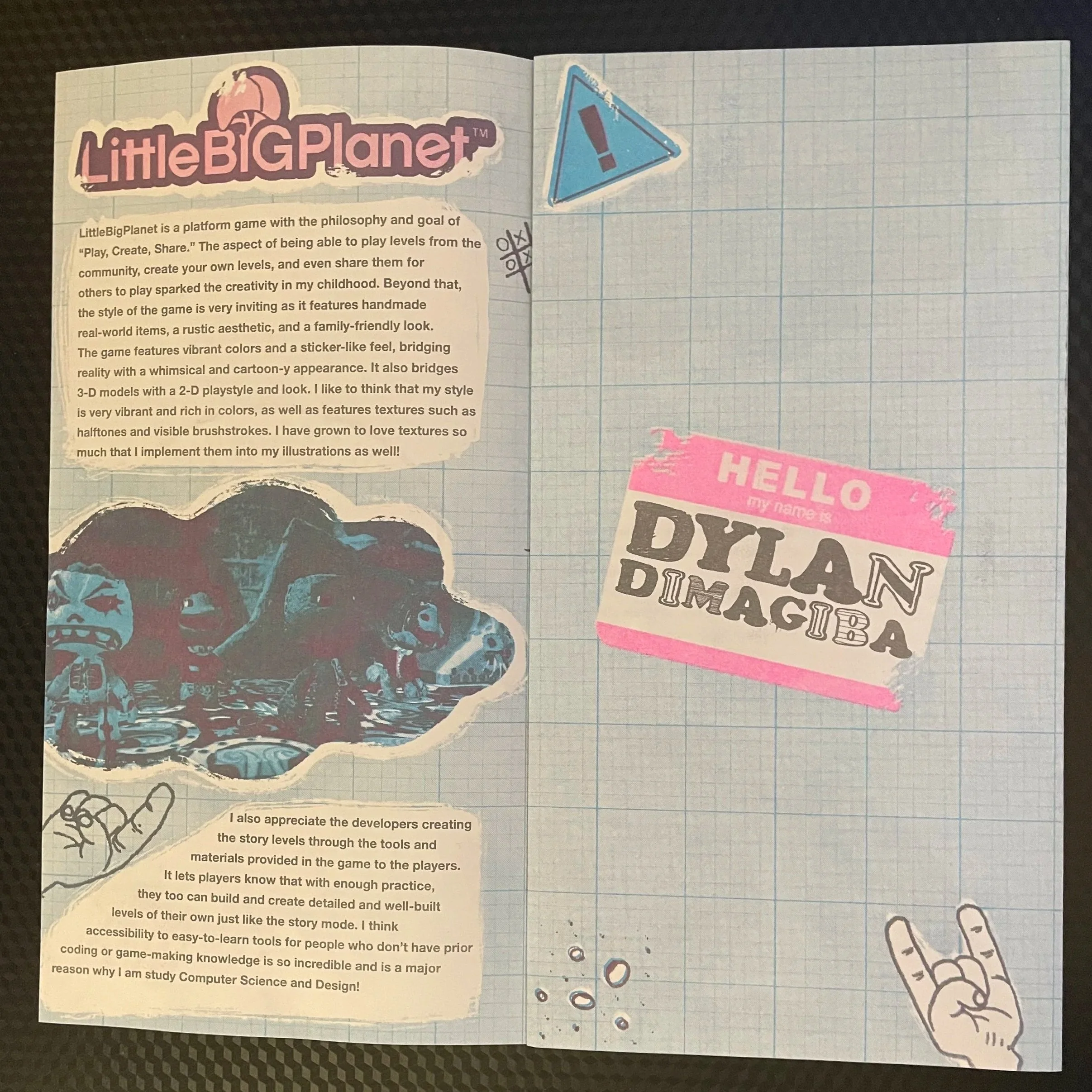
I decided to write and design about LittleBigPlanet, a video game designed for players to create their own levels, ranging from platformers to movies and much more. Players are also able to share their levels for the world to experience for themselves. The developers were able to create a game with easy-to-use tools and logic for players who may not have any programming expertise. The community that was fostered from this game consisted of imaginative creators and designers with great attention to detail and storytelling abilities.
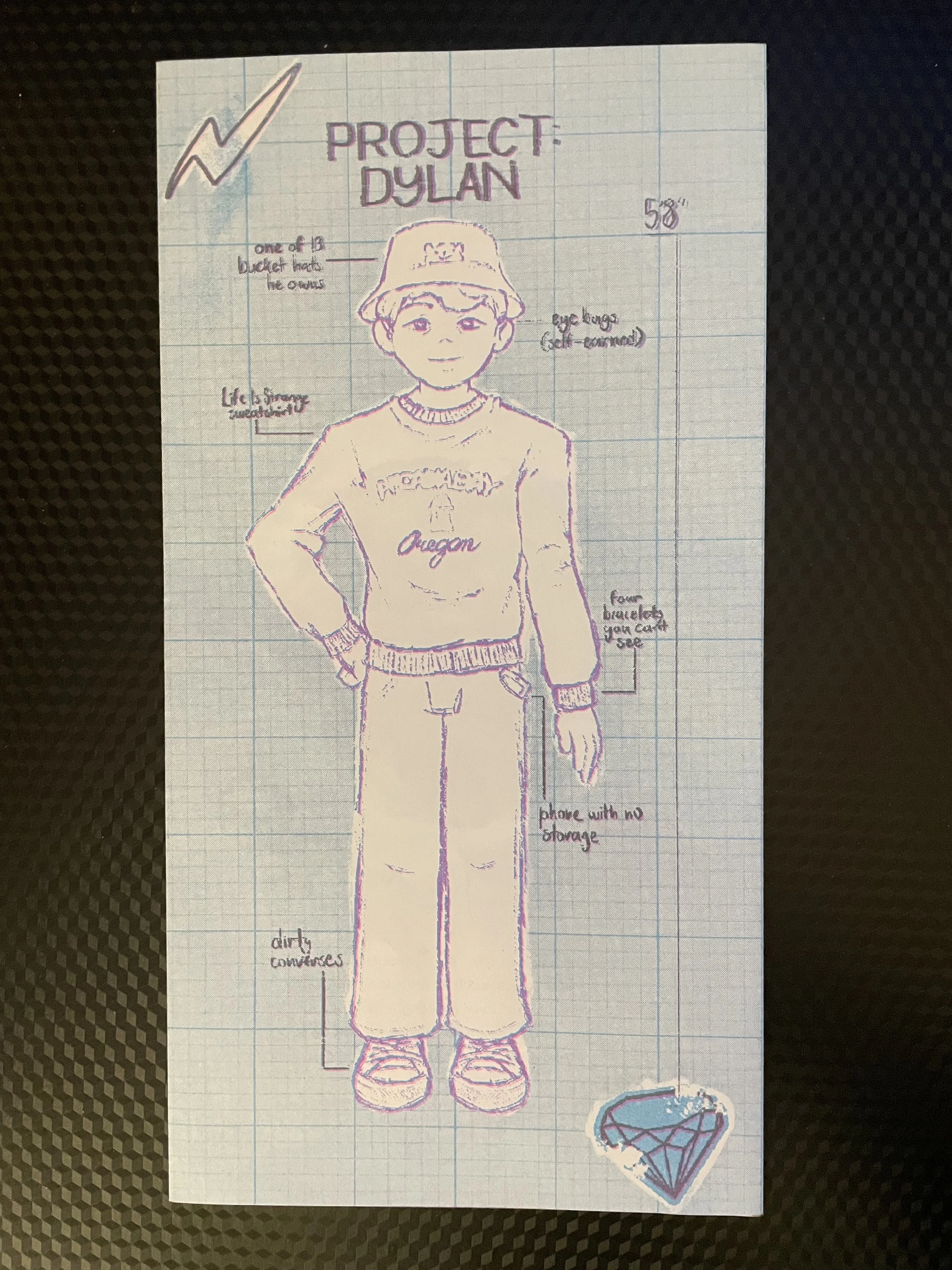
The game inhabits a home-made and nostalgic aesthetic to it. I like to think I took inspiration from its unique style as I love to blend 2-D assets with 3-D assets, and I also implement a lot of texture into my designs.
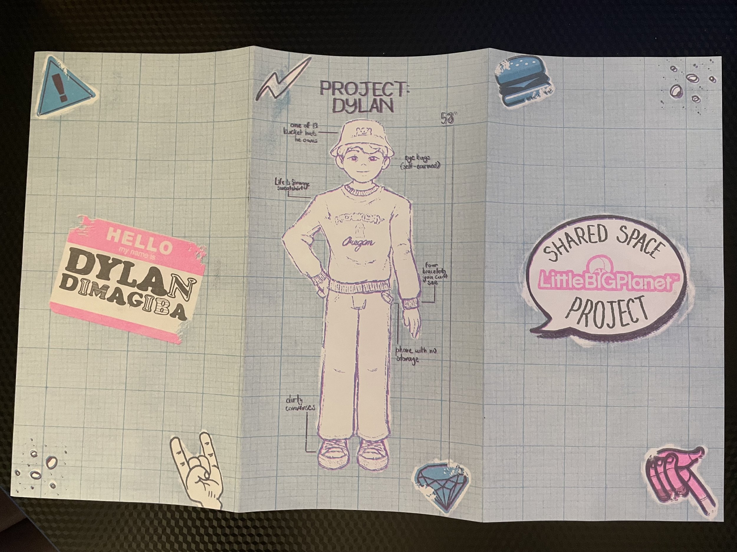
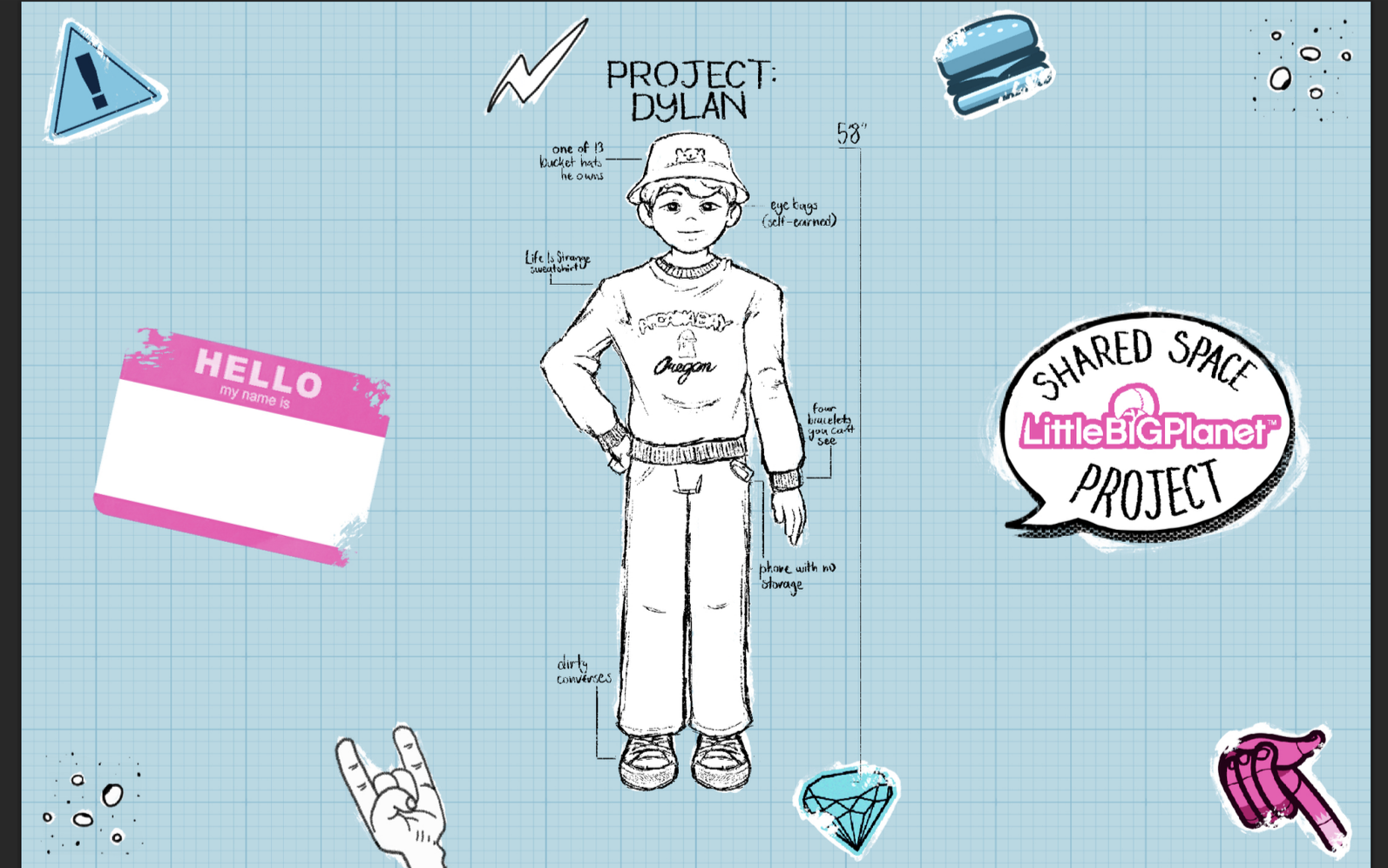
I knew I wanted my publication to imitate the playfulness and vibrancy of the game's aesthetic. I decided to use blue and pink for my color scheme as those were the main colors used for the marketing of the game. I added images from the game, two from official promotional art and one from a community level. I chose to download the sticker files extracted straight from the game to make the publication feel more home-made and DIY.
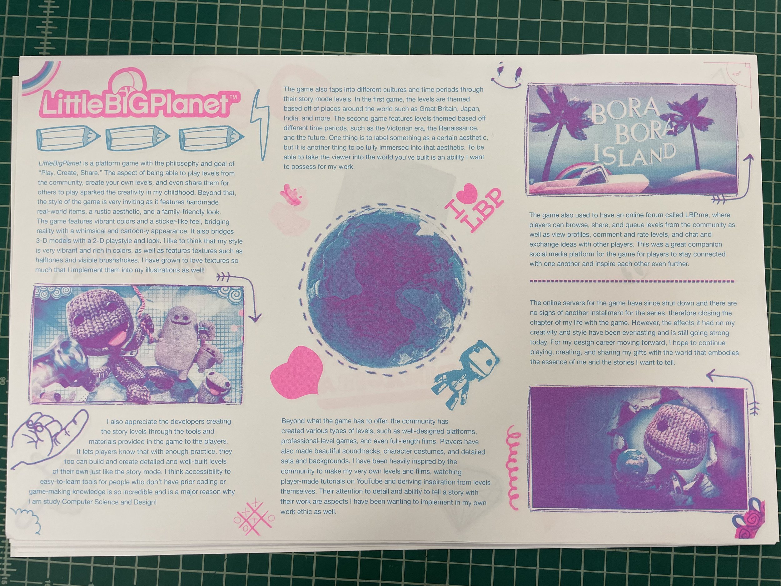
This was my original publication. I was still a little perplexed on how to use and master the RISO printer and how to prepare my file by placing colors effectively. The images had colors that did not feature aqua or pink, therefore causing them to look washed out. The text was also in aqua, making it difficult to read. I made the ultimate decision to restart my design, now having learned from my mistakes. The text and the images are all cohesive, the colors are more vibrant, and there is an elevated level of craftiness in its appearance.
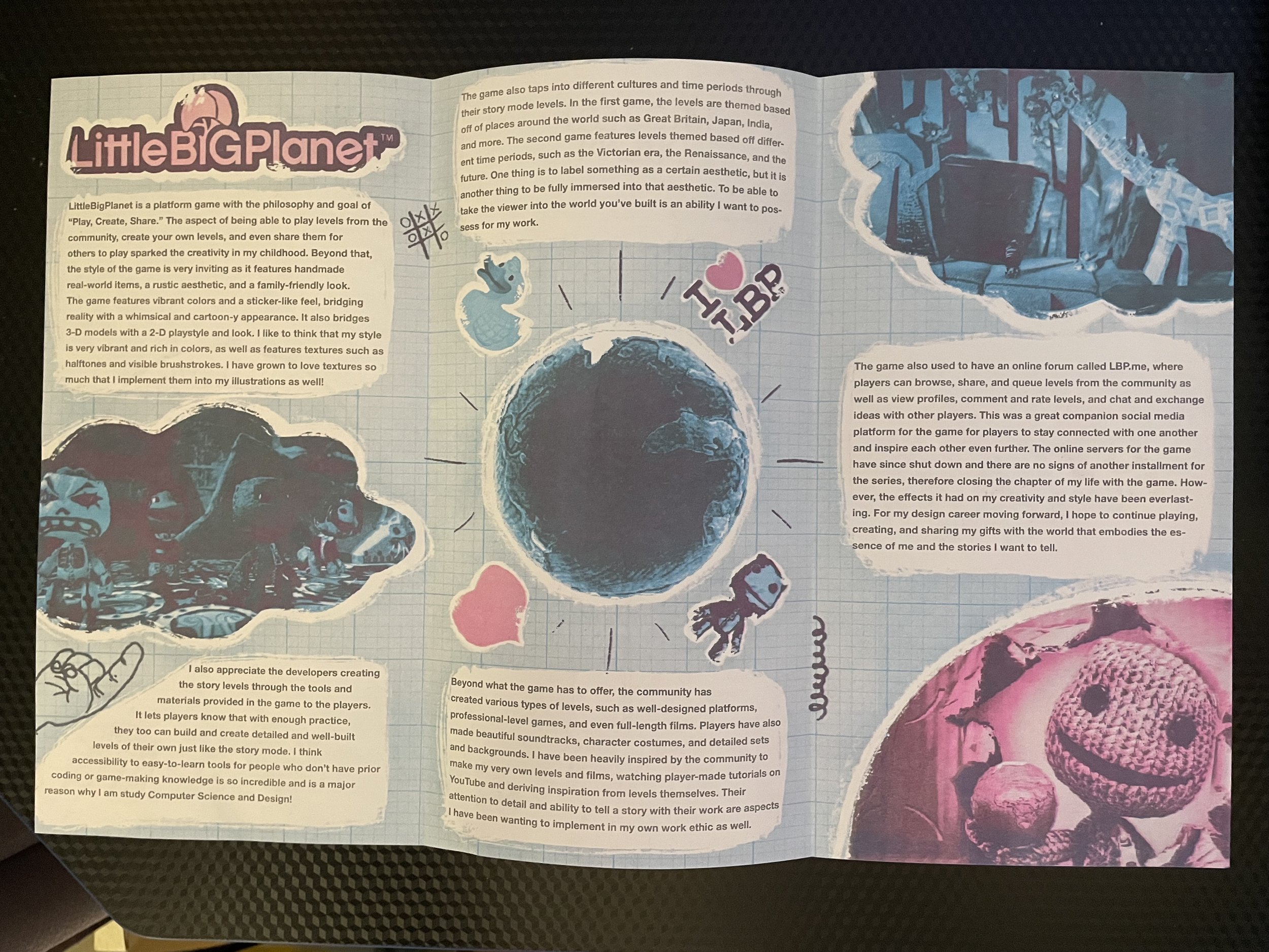
Here is the final version! I wanted to lean more into the blueprint aesthetic for the publication, so I decided to make it the background. I also filtered the colors aqua or blue onto the images I used to avoid from them looking washed out. To break up the text from the background, I added white bubbles with visible brushstrokes which add to the homemade vibes. I am super happy with the final outcome after I was able to fully get the hang of using the RISO printer.